You spent hours perfecting your offer. Your products are great. Your prices are fair. But visitors still aren't buying. What's going on?
Here's the uncomfortable truth: your color choices might be sabotaging your sales. Every single day, potential customers land on your website, see colors that feel "off," and click away before you even get a chance. It's not their fault. It's human psychology. Wrong colors trigger doubt. They make people feel uneasy. They whisper "unprofessional" or "untrustworthy" without saying a word.

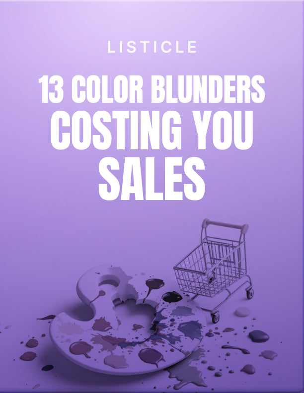
The Hidden Cost of Getting Colors Wrong
Think about the last time you landed on a website that just felt wrong. Maybe the text was hard to read. Maybe the colors clashed. Maybe it looked cheap or confusing. Did you stick around? Probably not. That's exactly what's happening to your visitors when your colors aren't working for you. Every poor color choice is a tiny crack in your credibility. And those cracks add up fast.
What If You Could Fix It in One Afternoon?
This guide reveals 13 specific color mistakes that are killing your conversions. Not vague theory. Not design school jargon. Just clear, practical problems and simple fixes you can implement right away. You'll learn which color combinations destroy readability, which palettes make you look amateur, and which choices accidentally push customers toward your competitors instead of your buy button.

Make Every Color Work Harder for Your Business
Each of the 13 tips is designed for real business owners who need real results. You'll discover how to use color psychology to build instant trust, how to guide visitors exactly where you want them to go, and how to make your brand look polished and professional across every platform. Whether you're tweaking your website, designing an email, or creating social media graphics, these insights will help you make smarter choices that actually move the needle.
Stop losing sales to fixable design mistakes. Get the clarity you need to make your visuals work as hard as you do.